This year, Instagram unveiled its shiny, brand new logo. This new logo has sparked fiery debate around the web and digital design community.
Some people love it. Some people, well, feel like a child stumbled upon a photoshop preset in their spare time.
Now, the quality of the Instagram logo will surely remain a topic of debate for some time, but the fact that Instagram and many other companies are using gradients in their branding shows that gradients are making a comeback in a big way.
In order to welcome this trend, I’ve compiled some great examples of gradients in the wild web, as well as some tools for you to implement gradients into your next design project!
Get Inspired
Here are three examples of gradients used in the wild. They are hand picked as good examples of this trend, and we hope you like them as much as we do.
Spotify

Recently, Spotify has revamped its website with a fun, pink to purple gradient in its header image. The gradient is loud and proud. Cheers to this beautiful revamp of your brand, Spotify.
You can check out their site at spotify.com/us.
Segment

Segment has done an excellent job popping the gradients against a dark background. In addition, the gradient overlay on top of icons throughout the site is a nice touch.
You can check out their site at segment.com/redshift.
VO2 Group
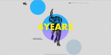
VO2 group’s approach to the gradient is fun and different. It uses simple shapes with a gradient overlay to add energy to the page. Its simplicity is well thought out and is a great example of gradients that are used as an accent element to a web design.
You can check out their site at vo2-group.com/en.
Gradient Toolbox
Want to use gradients for your next digital design project? Here are three tools to help you come up with the gradients for your next design as well as the tools to add it in the front end of your code.
Uigradients
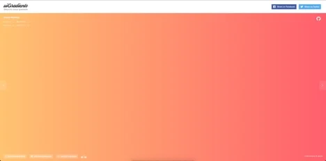
Uigradients.com is a nifty site that generates full screen gradients for you to get design inspiration for your next project.
You can check out their site at uigradients.com.
Ultimate CSS
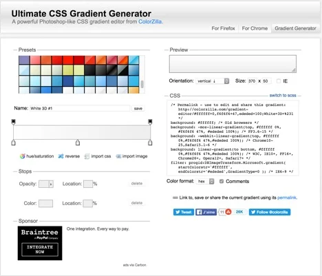
Ultimate CSS Gradient Generator is a great tool to help out with the front-end development of your gradients. Just punch in your gradient, and it will spit out the CSS you need to add to your style sheets.
You can use this tool at colorzilla.com/gradient-editor.
Gradient-Animator
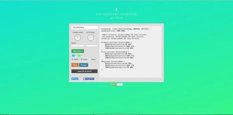
Want to add a little animation to your gradients? Just check out Ian Forrest’s Gradient-Animator. Be warned, this is very addicting, and you may find yourself fiddling with different color combinations an hour later.
You can use this tool at gradient-animator.com.
So what does this mean?
It appears gradients are going to be filling our screens for some time to come, so we might as well embrace it. Have fun, pull out your tool of choice, splash some colorful gradients onto your designs, and see what you can come up with.
Let’s make the internet a more colorful place together.

