
If you’re a designer, you know how tough it can be to find the PERFECT font that your client is thinking of. To hit the EXACT look and feel that they’re going for. It’s not their fault. Never in their lives did someone tell them it was important to know the difference between Serif, Sans Serif, Carter Sans and Nick Carter. That “Easter egg colors” and “rusty” are not the most descriptive of design terminology. So instead of sending them 14 different mockups in an attempt to pry their innermost text taste out of their oh-so particular color noggin, do everyone a favor. Get them to use Pinterest!
Say, “Hey client, looky here. I created a private board on this here Pinterest, and I’ve shared it with you and your beautiful mind.”
They say, “But, what do we do with this here Pinterest on that there board, gracious designer?”
You say, “EVERYTHING!”
If your client wants the look and feel of the homepage to be “beach house meets farm house” then dang-it you pin everything that resembles a hammock over a hay barrel.
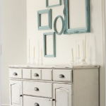
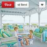
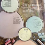
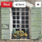
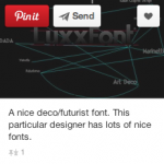
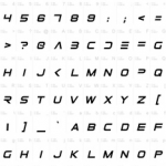
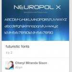
Client: “I want a font that’s like, futuristic and slick!”
You: “Oh you mean like, this?” *PIN*PIN*PIN*
Client: “BOOM!”
Use Pinterest to take the guessing game out of the designer/client relationship. Even if the end result is an oceanic farm design that smells like future. Mmmm…future.
“Victory! In your typeface!”
Preach, designer. Preach.
Bobby Dirienzo, 12South Music
