Typically, record labels and artist managers don’t have an in-house graphic designer or creative team to handle websites and other visual materials for their artists. Usually, they partner with an awesome creative marketing agency to handle that side of an artist’s career.
While working with the professionals will almost always give you the best results, sometimes that just isn’t an option. Budget, time, and a variety of other options may have you hiring a freelancer to revamp your artist’s website.
Or, you may even be stuck building it on your own.
If the thought strikes fear into your heart, worry not!
Even if you know absolutely nothing about designing an effective website, learning a few rules of thumb about UI and UX can help you make smarter design decisions.
What is UI and UX?
UI and UX are often confused as one in the same. They’re actually very different, and knowing that difference is critical:
- “UI” stands for “User Interface”
A website’s UI refers to the visual elements of a website that allow you to interact with the page. These are items like menus, buttons, links, and displays. UI is a lot like the readouts and buttons in your car. In order to change the temperature of your air conditioning, you’ll have to press a series of buttons and perhaps turn a dial. Just like your car, websites utilize interactive pieces that allows users to complete actions and give commands to the site. You’re using UI every time you play and pause a YouTube video. - “UX” stands for “User Experience”
UX (sometimes called UE) deals more with psychology and emotion. It literally describes a user’s experience while using the website. Was it frustrating? Was it seamless? Did they complete the action they came there to complete? How involved were they? A user experience designer will develop websites that are not only pleasing and interesting to use, but also serve to accomplish the goals of the client.
How will understanding UI and UX help me build a musician’s website?
The better you know your audience, the more informed design decisions you can make.
Everything about web design relies on great user experience. If you want someone to complete a specific goal on your artist’s website, they will need to be directed to do that action, and feel good about it.
A website’s user interface plays a huge hand in user experience. Frustrating, non-intuitive UI will not only prevent users from completing that action, but it will also leave them with a bad impression of the website, and ultimately, the brand.
Ok, enough banter, show me the tips!

1. Know who you’re designing for.
If your artist’s fanbase is mostly in their teens to 20’s, then chances are they understand social media icons and will be interested in the latest trends in technology. You can take more risks with them because they want to be surprised and entertained. But if your artist has a fanbase that primarily consists of retirees in Florida, you might want to stick to larger fonts and a more straightforward layout. The better you know your audience, the more informed design decisions you can make.
2. Make users excited to keep scrolling, instead of placing everything above the fold.
The “fold” is an outdated concept. There are so many different screen sizes these days that the fold can be at almost anywhere. So instead of making cramming all your most important information above the fold, focus on making your users interested enough to continue scrolling. That’s good UX.
3. Keep your content simple.
Less is more! A good rule of thumb is to keep just a few “overview” items on your homepage, then provide more detailed information on other pages. For example, if you’re launching a new artist, you might put a short, 1-sentence description of their sound on the homepage, with more in-depth bio info on the About page.
4. Avoid giving visitors too many options.
When a user arrives at your website for the first time, we want them to complete an action and to know exactly how to do it. When we ask them to do too many things right off the bat, they will quickly become overwhelmed and leave. Or, if too many options are presented and the user is asked to make a choice, they may avoid the decision altogether and move on. This is called analysis paralysis.

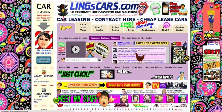
“What? You mean you can’t figure out what to do on this page?”
5. Avoid external links and keep users on your website as long as possible.
Your website is the one place on the internet where you have total control over someone’s experience. This is your branded domain. Keep folks there as long as possible. Use a music player embed so they can hear the music right on the site. Instead of linking out to a Facebook post on Facebook, write up a blog post about it. Link out only when you must.
6. Use story to design an emotional experience.
We know that good UX will make your users feel something, and become emotionally invested.
Click here for a blog all about emotional marketing
You want to draw your users in. Use high quality visuals and impactful video to lead users along the page in a way that tells a story.
7. Make the effort to do responsive right.
Most DIY website builders these days come with some sort of responsive capability. If you’re going to make the effort to make your website responsive, then be sure to make the mobile experience just as amazing as the desktop experience.
8. Users don’t read, they skim.
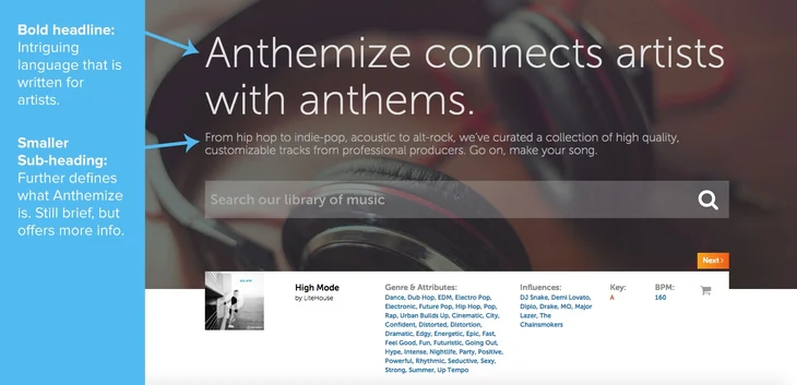
No matter how much we’d like to believe that our visitors are reading every last word up and down our home pages, the overwhelming truth is: people skim on the web. Large walls of text tend to be a huge turn off for site surfers. They want their info and they want it fast. Optimize all your text to be skimmable – use brief headlines with a larger font size, bullet notes, and have well defined text hierarchy.

9. For long bio text or blog posts, make the text column the appropriate width.
When you do have to include a large amount of text on your site, make the reading experience as optimal as possible. Columns that are too wide make it feel like you’re reading miles of text. If it’s too short, you feel like a maniac jumping from line to line. Bad UX. Take one from print world and reference the type-size-to-column-width ratio of books and magazines. Common practice: 45-75 characters long for font sizes 14px-16px in size.
10. Use established design patterns to avoid confusion and increase intuitive ease of use.
That’s a big fancy way of saying, “Don’t reinvent the wheel.” Established design patterns are pieces of UI or or other visual items that we’re used to seeing over and over again. We already know what they mean. For example, we’re used to seeing a logo placed in the top left-hand corner, and nav links running across the top. We’re familiar with the concept of a footer and what type of info they usually contain. If it ain’t broke, don’t fix it.
11. On the flipside: Avoid design patterns that do not align with your audience.
On the contrary to number 10 above, you’ll want to avoid certain design patterns, even if they’re widely used, if your specific audience will be confused by them. For example, many elderly internet users will not be as familiar with the hamburger icon, since they probably haven’t been using the web long enough to encounter it many times.


There you have it! I hope these help, and let me know if you have any questions or extra tips in the comments below!

