Parallax scrolling.
If you are a web developer or designer, you have probably heard the word parallax. You may be wondering, “What are you parallax, and where did you come from?” I mean, it is a fun word to say, but there is much more to this word than just it’s pronunciation.
What the heck is it?
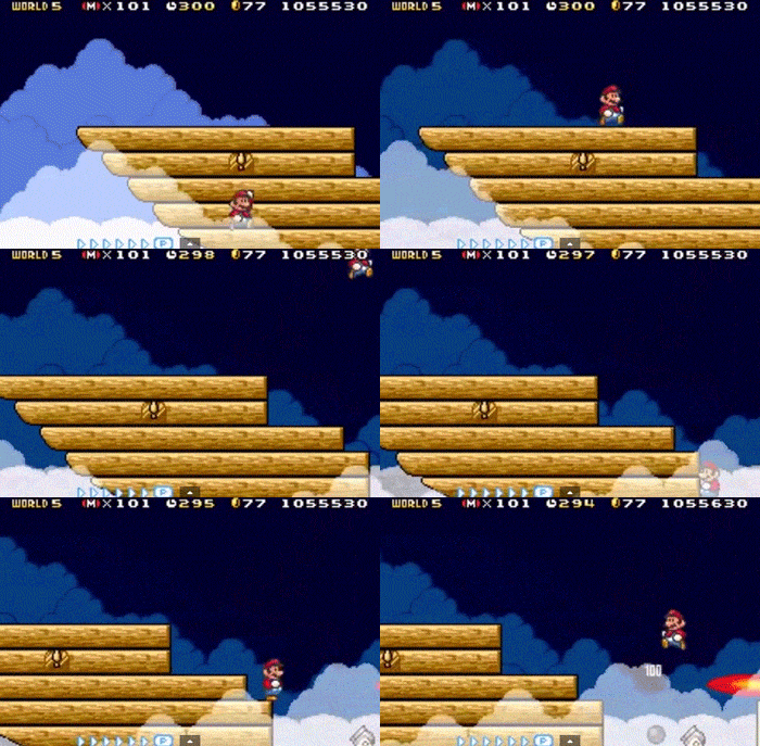
According to Dictionary.com, parallax is “the apparent displacement of an observed object due to the position of the observer.” In layman’s terms, when something is parallax scrolling, two or more objects are moving on different planes at different speeds. Look at the GIF below, and you can see one of the first uses of parallax scrolling in media.

Go, Mario, Go! If you cannot pinpoint where the parallax scrolling is occurring, watch the clouds in the background, foreground, and then Mario on ship in the middle ground. These three layers are moving at different speeds, and their movement creates a sense of depth and involvement within the world.
Now, because most web developers have played Mario their entire lives, they got the idea to implement parallax scrolling within websites. The use of parallax scrolling within websites can be incredibly effective when used in the right context.
Let’s look at some cool examples.
The Ràtatattoo: Tattoo & Tattoo Make Up
This site is really nifty. Upon entering you are immediately engaged by the quirky imagery and excellent usage of type and color. The parallax comes in when you click on a new link in the main nav bar. This sends you down the page and all of the elements cycle through in a seamless fashion. Overall, this site is killer and the usage of parallax is well done.
Danny Brown’s Sky High Interview
This web interview is one of the most creative uses of parallax around. It takes you on a journey as Danny Brown falls from the sky, and tells the story by engaging the user in a way that no other standard story-telling method can achieve. The only issue is the loading time, which is usually an issue with most parallaxing sites. Due to all the graphics, motion, and video, an approach like this is probably best for promotional pieces. A site like a t-shirt store would want to steer clear of this approach unless they wanted to make a promotional page for a new product.
La Moulade
La Moulade is pretty awesome because it takes you through the story of the company as well as a snippet of its portfolio all on the landing page. It has the same story telling element of the Danny Brown site listed above, but it keeps you in one place much like Ràtatattoo. That coupled with an awesome overall design makes this site killer.
With great power comes great responsibility.
Each of the websites above are well-executed examples of parallax, but the technique certainly not all-purpose. Here are some things to keep in mind when adding parallaxing to your website:
- Parallaxing sites are often hefty and have long load times.
There are many people who do not have powerful computers or slow internet that may not be able to access your site if it is too bogged down from effects. Keep in mind your website’s demographic, if your viewers are generally more tech-savvy individuals, you’re fine. - Poorly designed sites with parallaxing can be incredibly confusing.
Some users may become lost if your site gets too crazy with the parallax madness.
Parallax is a hip web trend, and surely something will take its place in the future, but for now, let’s all scroll to our hearts content.
Feature image by: JD Hancock


